An accent wall should solve a design problem. It might give a plain room a focal point, make a desk feel intentional, or bring warmth to a bedroom without changing every surface. Painting one wall a different color is easy. Choosing the right wall, finish and scale is where people usually go wrong.
These 27 accent wall ideas cover paint, wood, texture, pattern and practical built-ins. Each includes where it tends to work, why, and a trade-off to consider. The goal is a room that looks considered in daylight and comfortable at night, not a dramatic photograph that becomes tiring to live with.
Choose the right wall first
Stand at the entrance and notice where your eye settles. The wall behind a bed, sofa, desk or dining bench is often a useful candidate because it already supports the room’s main activity. A narrow wall interrupted by several doors can make a treatment look accidental. Check the wall’s surface and moisture condition before covering it. If you rent, check the lease and test whether a removable finish really suits the existing paint.
Any large paint sample should be examined in the morning, afternoon and under the lamps you actually use. A charcoal that appears rich in a bright store can feel flat in a north-facing room. Repeating the chosen finish on a small accessory can connect the wall to the rest of the space, but do not buy everything in the same color.
Paint accent wall ideas with restraint
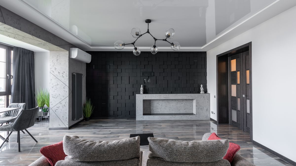
1. Charcoal behind a light sofa
A deep charcoal wall can make a pale sofa or warm timber console stand out without requiring patterned wallpaper. It suits a living room with enough light and furniture that does not disappear against the wall. Test several charcoal shades, because some turn blue and others brown under artificial lighting. A completely black room is not necessary for a confident focal point.
If the wall is behind your sofa, place your largest paint sample directly above the backrest rather than near the ceiling. Compare it with upholstery, flooring and any dominant timber tones. Charcoal paired with brass or tan leather produces a different mood from charcoal with chrome and white fabric. A nearly black wall can also reveal surface imperfections under side lighting, so proper filling and preparation matter before the final coat.
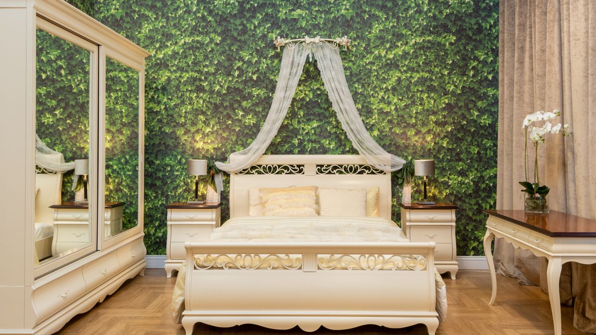
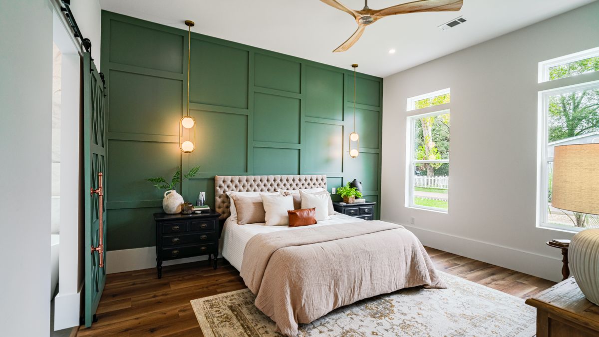
2. A deep green wall behind the bed
A saturated green wall can anchor a bedroom without making every surface dark. The color works particularly well behind the headboard, where it frames bedding and establishes one calm focal point. Compared with the softer sage option later in this list, this treatment makes a stronger color statement. Sample the shade next to the actual flooring, headboard and curtains, because undertones determine whether the green feels lush, grey or muddy.
In a bright bedroom, a richer green may remain comfortable throughout the day; in a room with little daylight, a lighter or warmer variation may be easier to live with. Keep the neighboring surfaces mostly neutral, then repeat the green sparingly through a plant or small textile. If the headboard already has a strong shape, avoid adding unrelated wall trim that competes with it. Good bedroom color is about restfulness and composition, not selecting the darkest swatch available.
3. Navy in a home office
A navy accent wall can create a defined backdrop for a desk, especially with lighter shelving and good task lighting. It should support concentration rather than swallow the monitor in a dark corner. Check how the color looks on video calls if you appear in front of it. A matte or low-sheen finish can help manage reflections, depending on the paint and surface.
Video calls change what counts as a successful backdrop. Sit at your desk and look at the wall through your actual camera before painting; a color that feels calm in person may make the room appear unusually dark on screen. Try a narrow shelf or one framed print rather than several distracting objects. If the workspace is small, the surrounding desk and storage should stay practical. The accent wall should communicate order, not advertise how many gadgets you own.

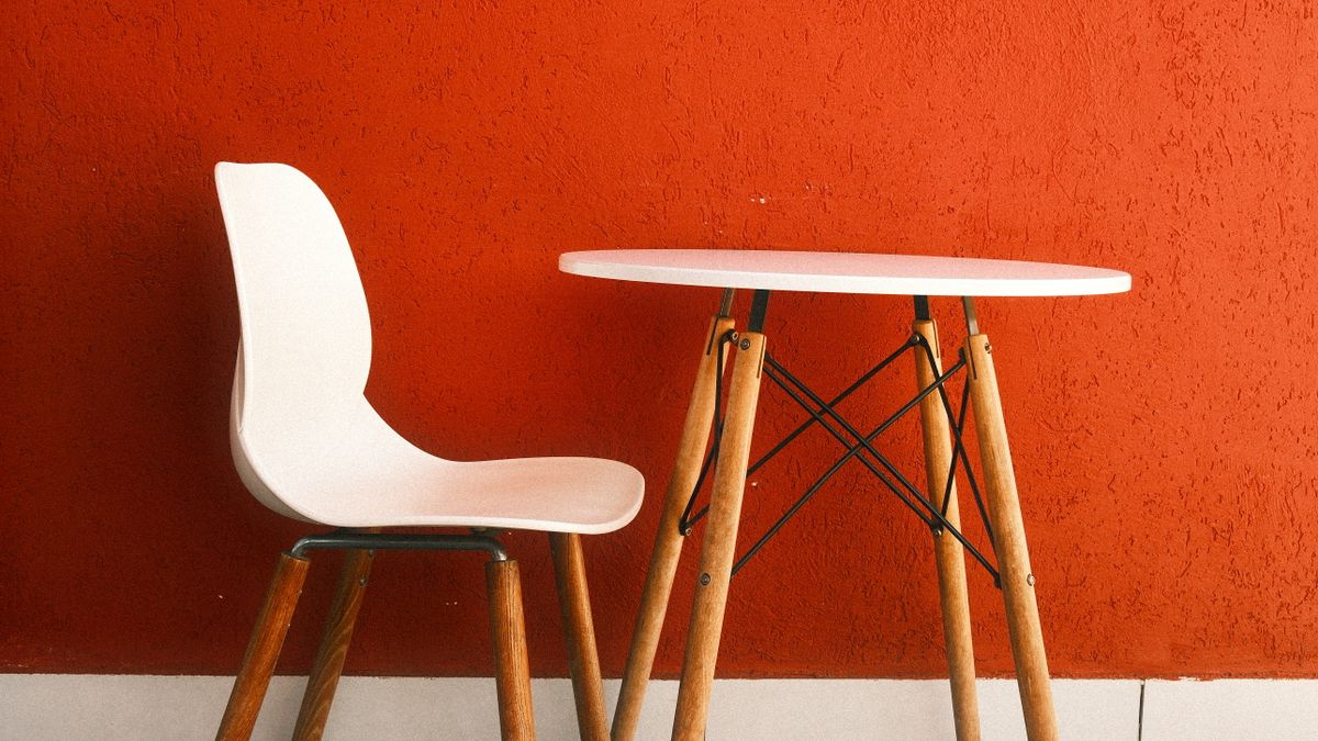
4. A warm orange accent beside a simple table
An earthy orange accent can soften a room dominated by metal, white cabinets and pale floors. Even a small table and chair arrangement becomes more deliberate when the wall behind it has a distinct color. The photograph shows a brighter orange rather than muted terracotta, which is a useful reminder that orange paints vary dramatically in intensity. Sample several shades in the actual space rather than buying based on a filtered inspiration photo.
If you prefer a restrained look, search for brown-leaning terracotta rather than a vivid orange. Test it in morning and evening light because warm bulbs can make the color look more saturated. Natural wood and neutral upholstered seating often balance stronger paint. A simple table setting is enough to create the focal point without committing to a new dining suite or decorative shelves.
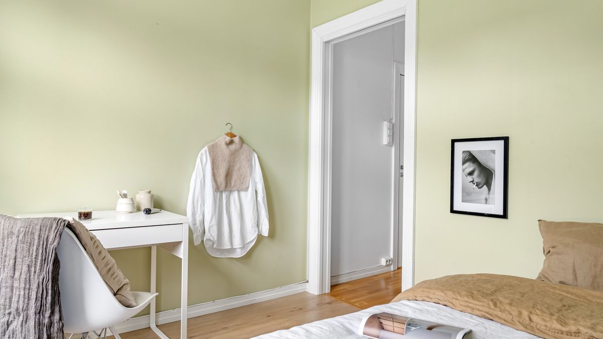
5. Muted sage behind the bed
Sage is useful when you want a subtle contrast with white or beige walls. It can work with timber, dark bedside lamps and simple linen bedding. Keep the rest of the palette quiet so the wall feels intentional. Some sage tones appear grey in indirect light, so sample them on the actual wall before deciding that the room needs more color.
A sage wall suits a quieter bedroom where the bed remains the strongest object. When selecting the shade, compare it with the curtain fabric and the amount of cool daylight entering the room. A grey-leaning sage can make white trim feel crisp, while a warmer sage pairs more naturally with cream and oak. Choose a lower-sheen paint where appropriate if you prefer a soft finish. Too much matching green bedding can flatten the contrast that made the wall useful.
6. A dark burgundy reading nook
A wine-red wall behind a reading chair can give a small corner its own identity. Warm lamps, brown leather or walnut furniture suit the richness of the color. If the wall is already shaded, the room may need better lighting rather than even darker paint. Limit decorative clutter; the color is already doing much of the visual work.
Burgundy is dramatic enough to make a reading nook feel enclosed even without architectural partitions. That can be pleasant if the chair has good lighting and a nearby table, but overwhelming if the corner is already dark and cramped. Let the lamp, artwork and furniture remain distinct from the wall. A single brown leather seat may be stronger than matching everything in red. Sample near the existing floor, because reddish-brown timber can shift how the color reads.

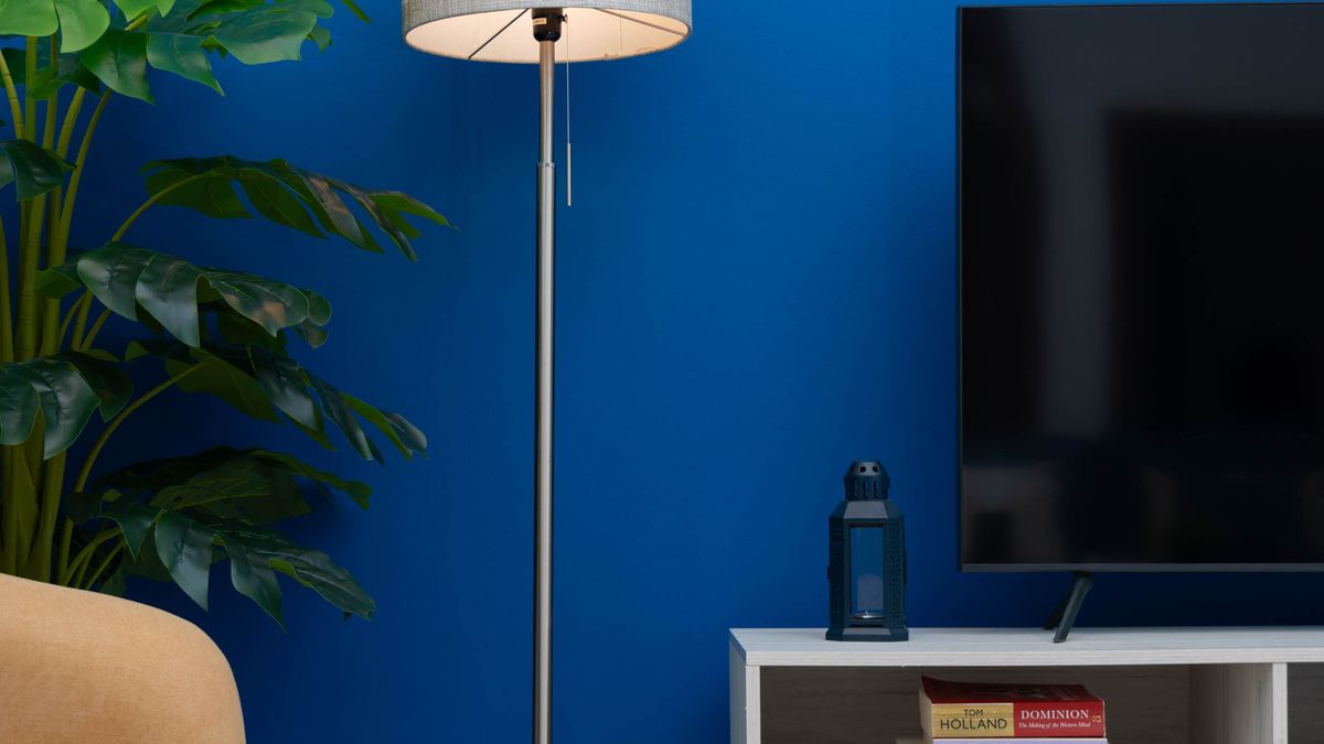
7. A muted blue living-room feature wall
Blue can create a distinctive focal wall without making the entire living room feel cold. The most versatile versions lean toward a muted or dusty shade, but the result depends on the floor, upholstery and daylight. Behind a cream or light-gray sofa, a blue wall creates a clear outline; near a television it can give the media zone a deliberate center. Paint large samples and view them from the room entrance before you commit.
Treat the photograph here as a layout reference rather than a substitute for sampling the exact shade. You can use a stronger blue for contrast, or choose a softer gray-blue when the room already has dark furniture. Repeat the color only once or twice in cushions or artwork rather than matching everything. Warm timber, cream fabric and black metal each change how the blue reads. The goal is controlled color, not an overly coordinated theme.
8. A two-tone horizontal split
A darker lower section and lighter upper section can give a dining room, hallway or office more structure. Choose the dividing height in relation to furniture, windows and trim rather than copying a measurement from a social post. A clean line is essential. This treatment is often easier to change than installed wall paneling, but it needs careful preparation and masking.
The dividing line should respond to a real architectural cue, such as the back of a bench, window sill or existing trim. A perfectly arbitrary halfway point can make tall furniture look cut in two. Sketch the split on a photo of the room at several heights before painting. Consider which section should carry the darker color: a deeper lower zone often grounds a space, but a dark upper treatment can create an entirely different atmosphere.
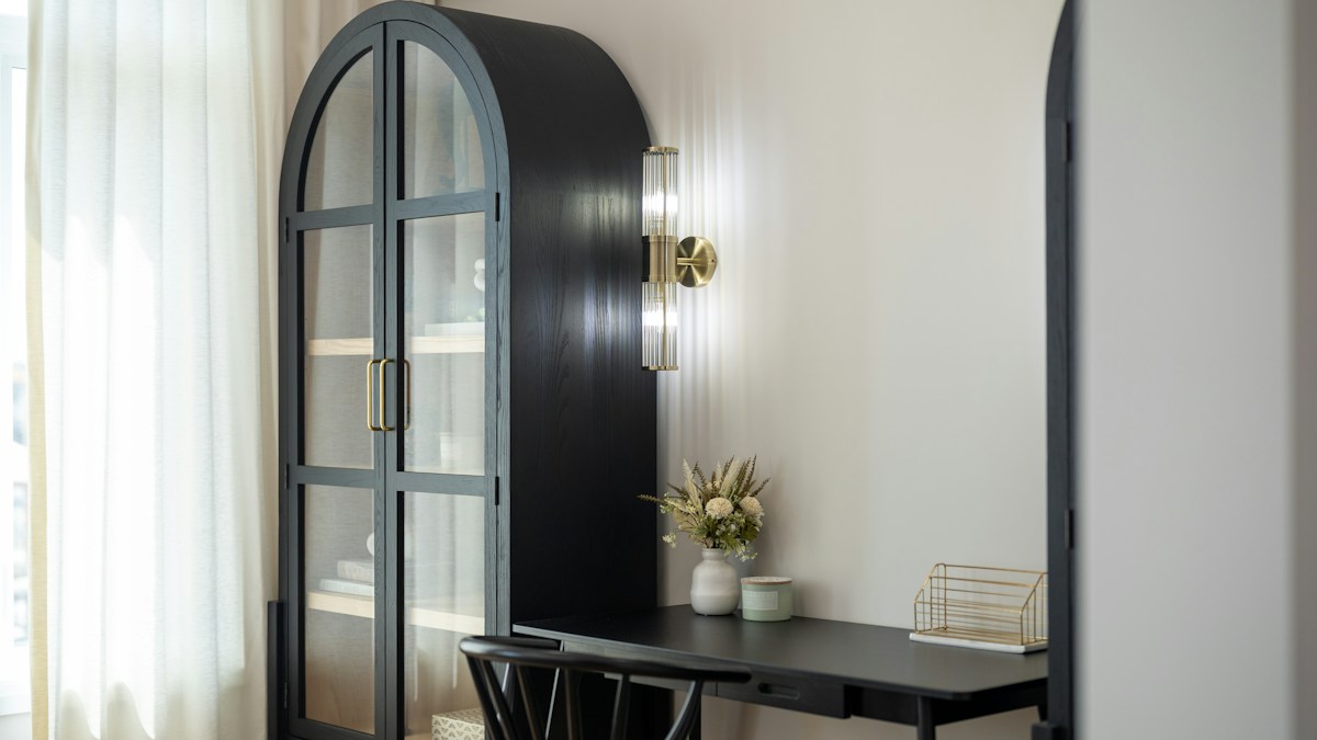
9. An arched built-in niche behind a desk
An arched niche can turn a compact workspace into a focal wall while keeping the rest of the room visually quieter. The example uses a dark arched cabinet surround with a desk, not a painted faux arch. The architectural shape provides depth and identity without additional wall art. This treatment is useful when you have the budget and wall space for a built-in feature.
For renters or smaller budgets, a painted arch is a lighter alternative, but it will not add physical storage or depth. Sketch the desired shape around the desk before choosing either approach. A simple curve is easier to repeat consistently than a complicated outline. Check sockets, task lighting and usable clearance so the wall treatment improves the workspace rather than squeezing it.
Wood, paneling and textured accent walls
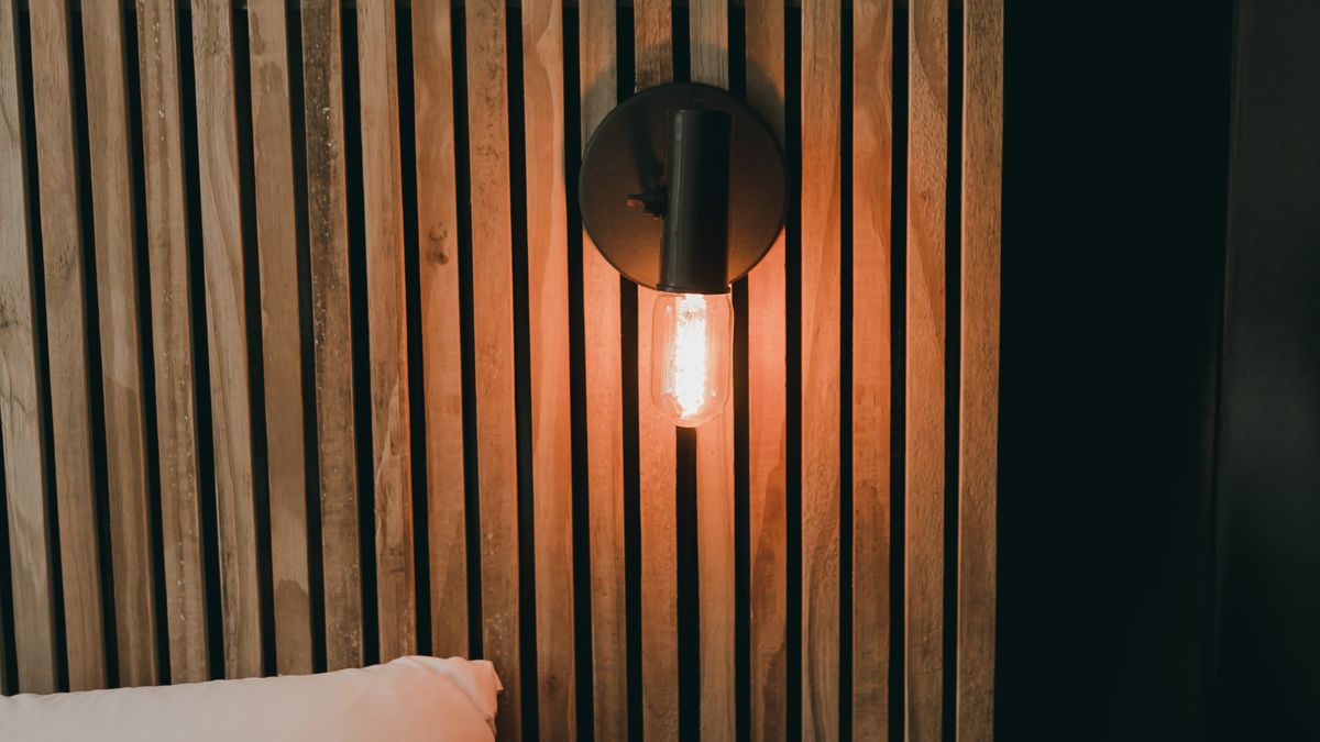
10. Vertical walnut-look slats
Vertical slats can create rhythm behind a television, office desk or low media console. Their most valuable quality is depth and shadow, not simply the wood color. Check the panel’s fire rating, installation system and cleaning demands, and do not cover electrical fittings. Fake wood finishes vary widely in realism, so inspect a physical sample in the room.
Before purchasing slat panels, compare real samples with the room’s floor. A warm walnut-look slat over yellow-toned flooring can make the whole room feel too orange; cooler dark timber may be better. Determine how the panels end at corners and how a television mount or socket interacts with them. If the wall is behind a screen, keep reflections and ventilation in mind. The room usually benefits from one strong slatted surface rather than several competing timber patterns.
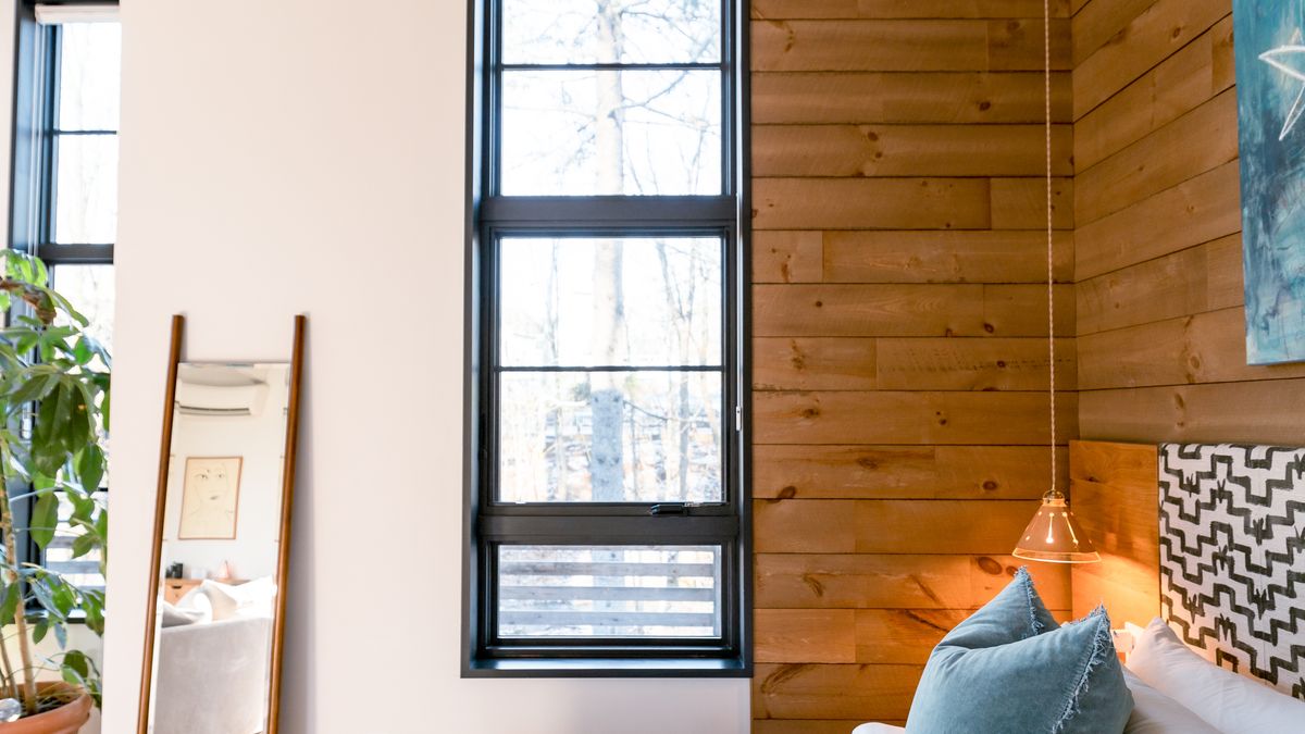
11. Natural oak paneling
Light oak can warm a room dominated by glass, white plaster and black metal. It suits a dining nook or bedroom where you want texture without a strong color. Keep the grain direction consistent and align panel joins deliberately. A large area of pale wood can still feel busy if the boards are narrow and the rest of the room contains too many competing patterns.
Natural oak has enough grain variation to create detail without a busy color. It is particularly effective beside dark metal desk legs, neutral seating or a stone-look console. Choose a consistent board width and decide whether the surface should read as one continuous plane or as individual planks. The finish needs to suit cleaning and sunlight exposure in that particular room. A poorly matched patchwork of pale woods can seem less intentional than painted paneling.
12. Painted board-and-batten
Board-and-batten adds architectural rhythm to a plain wall and can be painted the same color as the background for a restrained effect. It works behind a headboard or across a dining area. Plan panel widths from the wall’s actual dimensions and door positions. Poor spacing leaves awkward skinny sections at the edges, so sketch the grid before cutting material.
Lay out the full pattern on paper using the real wall width. The design often becomes awkward when panels at the edges are only a fraction of the central ones. Start with the bed or sofa centerline and decide whether the grid aligns with that focal point or with the wall itself. Keep trim depth appropriate for doors and windows. Simple, regularly spaced panels painted one color can look more controlled than an unnecessarily elaborate lattice.
13. Narrow picture-frame molding
Thin decorative molding can make a simple living room or hallway feel more composed without introducing bold color. Keep the panel proportions aligned with furniture and avoid placing a seam behind a light fixture. When painted in one consistent color, the effect comes from soft shadows. This is not an ideal DIY project if the wall is uneven and you cannot prepare the joints cleanly.
Picture-frame molding works because it creates shadow and rhythm rather than major texture. Use fewer, larger rectangles on a small wall; too many narrow frames can look busy. Align the panels with the furniture or architectural axis rather than letting them stop at random heights. A color-matched paint job can hide minor visual complexity, but gaps and uneven joints will still catch the light. Preparation and measured spacing are the most important parts of the result.
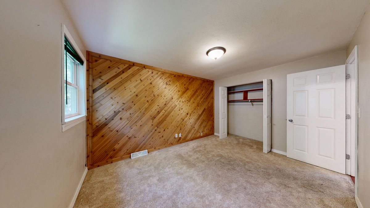
14. A warm wood-plank feature wall
A single plank-clad wall creates texture without relying on wallpaper or strong paint. The boards can be light or dark, rustic or clean-lined, but the most convincing arrangement has a consistent visual rhythm. A wood-plank surface often works in a study or spare bedroom where the wall can be viewed in full. Unlike the pale oak panels earlier in this list, the emphasis here is a more pronounced plank pattern and a warmer, wood-forward atmosphere.
Check board spacing, the direction of the grain and how the planks finish at the corners. Natural materials vary, so order real samples and compare them in the room before committing. If you are buying genuinely reclaimed wood, separately investigate its history, possible coatings, damage and insect treatment. A photograph of timber planks does not prove they are reclaimed. The wall should support the furniture and lighting rather than becoming a visual patchwork of every wood tone you can find.
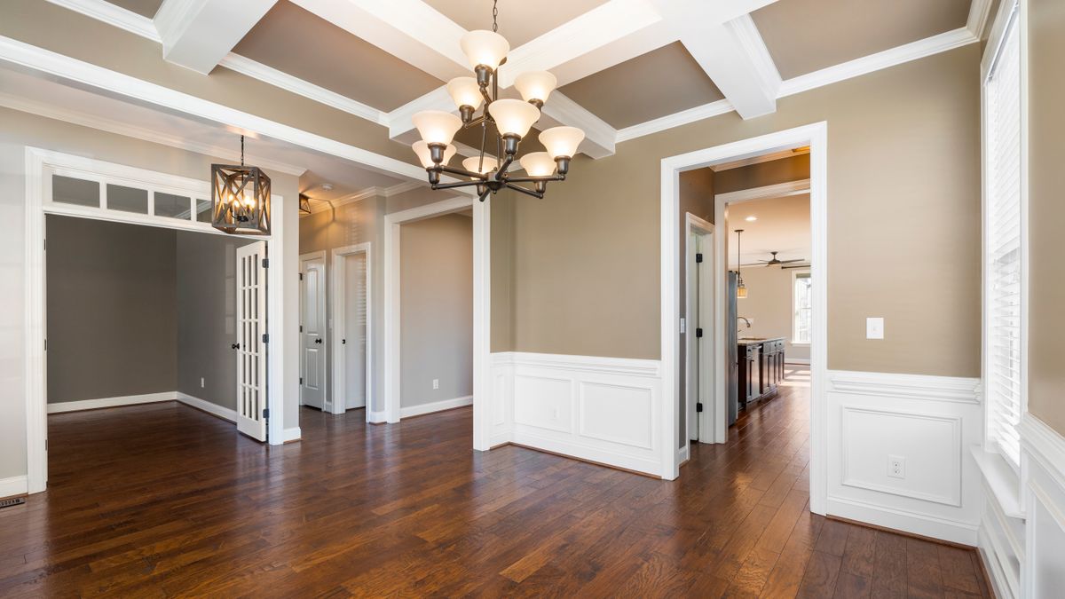
15. Half-height painted wainscoting
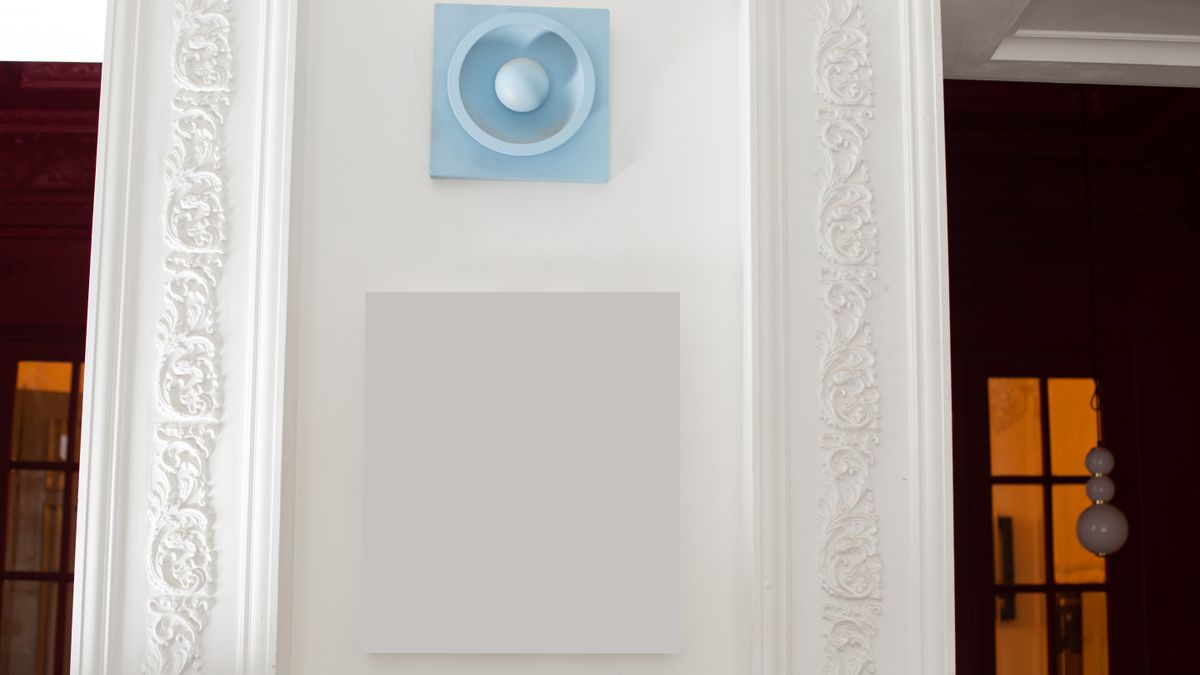
Half-height molding can make a corridor, dining room or spare bedroom feel more finished while giving the upper wall room for paint or artwork. The pictured treatment is traditional wainscoting, not tongue-and-groove boards. It shows how a lower panel line can relate to door frames and other architectural features. This is a strong choice when you prefer controlled trim over rustic timber texture.
Set the upper edge with nearby doors, switch plates and furniture in mind. In a narrow hallway, too many closely spaced trim rectangles can make the wall feel busy. If you prefer a vertical board finish, tongue-and-groove paneling is another option, but its rhythm and installation details are different from this example. Measure the real wall before buying moldings.
16. Smooth limewash-inspired texture
A softly mottled wall can add depth when a single flat paint color feels too plain. Choose an appropriate mineral or specialty finish for the actual substrate and follow its application requirements. The result is usually more varied than a standard roller-painted surface. If you want a perfectly even finish, this is probably the wrong treatment; sample a sizable area first.
Limewash and similar finishes are material-specific, not merely regular paint applied carelessly. Check whether the substrate needs specialist preparation and whether the finish is suitable for bathrooms, kitchens or frequently touched areas. A large mockup reveals the scale of cloud-like variation better than a tiny sample. Keep nearby upholstery and artwork simple so the wall remains a soft backdrop rather than an additional pattern competing for attention. If uniformity matters most, choose ordinary high-quality paint instead.

17. Subtle plaster relief
A skilled plaster finish can bring tactile depth to a bedroom or lounge while staying within one neutral color. Light grazing across the surface creates most of the interest. The preparation, material and labor matter, so it is not necessarily an inexpensive alternative to wallpaper. Avoid dramatic texture around narrow walkways where it will repeatedly collect marks or be difficult to clean.
Relief catches grazing light, so test the design beside the room’s actual windows and lamps before paying for the finish. A softly textured surface can be subtle in diffuse daylight and extremely dramatic under a wall washer. Choose how much variation you genuinely want to see. Highly raised surfaces may be awkward behind a dining bench or narrow passage where bags and chairs make contact. The extra cost should buy a distinct tactile result, not just the appearance of an unfinished wall.

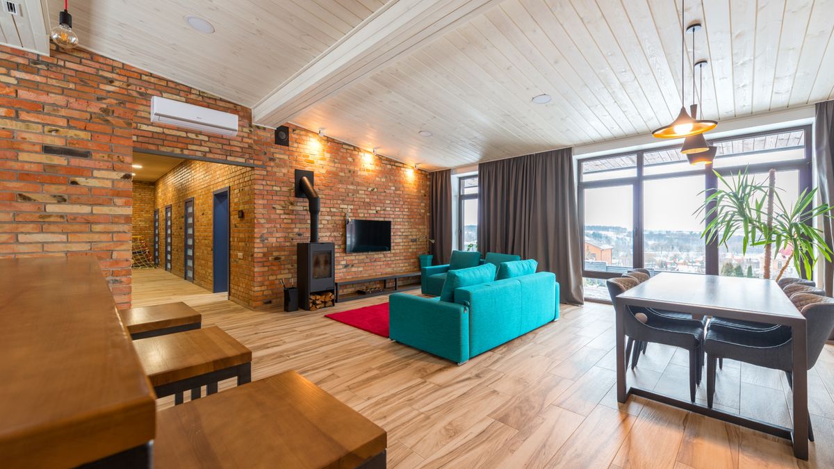
18. Brick as a single architectural surface
Exposed brick can be a strong backdrop behind shelving or a media console when the building genuinely has suitable brickwork. If adding brick veneer, consider depth, weight, fixing and clean edges around openings. The wall should feel integrated with the room rather than like a stage backdrop. Leave moisture problems unresolved and the finish will not solve them.
Exposed brick works best when it feels like a real material decision in the room. Pairing it with a restrained sofa and simple lighting can give a strong industrial note without relying on an entire industrial theme. If installing brick veneer, calculate how it affects sockets, skirting, door trim and furniture clearance. Take moisture and wall structure seriously. On an already irregular wall, realistic brick can emphasize imperfections rather than magically hiding them.
Wallpaper, art and functional feature walls
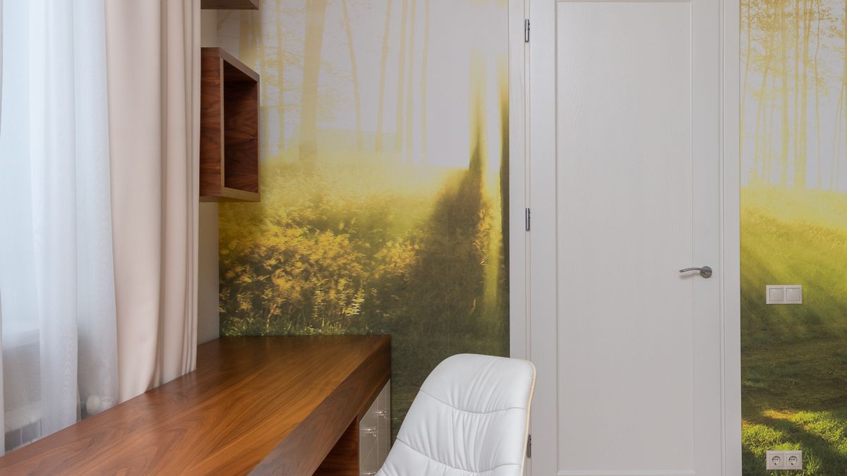
19. Oversized landscape mural
One large landscape illustration can make a bedroom or home office feel more open, but the crop matters. Choose a horizon and visual scale that work when furniture covers the lower section. Avoid tiny complex details that compete with books, screens and artwork. Use licensed wallpaper or artwork and verify the image resolution at the printed size.
A mural becomes part of the room’s architecture because furniture covers sections of it. Position the important horizon, animal or landform above the sofa or headboard rather than behind it. Check the image at the intended print size, since an attractive digital preview can become soft or pixelated when enlarged. Choose one focal subject and leave quieter space near shelves or windows. If the room is small, a low-contrast landscape may be easier to live with than dramatic scenery.
20. Geometric wallpaper in a living room
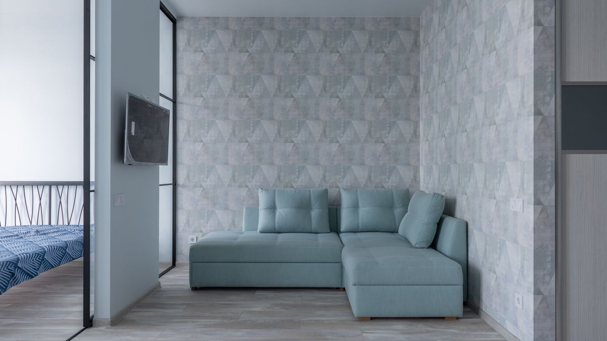
A graphic repeating pattern can add energy to a quiet room without demanding complicated furniture. The most practical wallpaper designs have clear rhythm and enough contrast to make the focal wall distinct. Choose the scale of the pattern carefully: tiny shapes can feel restless at a distance, while broad geometric forms may be more comfortable behind a sofa. Consider where artwork and windows interrupt the repeat before you buy.
Tape up several joined samples at the height where you will normally view the wall. A pattern that looks refined on a computer may dominate once it covers several square metres. If the living room already has a patterned rug or strongly veined stone, consider a simpler wall treatment instead. The example photograph shows wallpaper supporting a sofa and television rather than requiring an elaborate decorative scheme. Be precise with installation and seam alignment, because geometry reveals mistakes immediately.
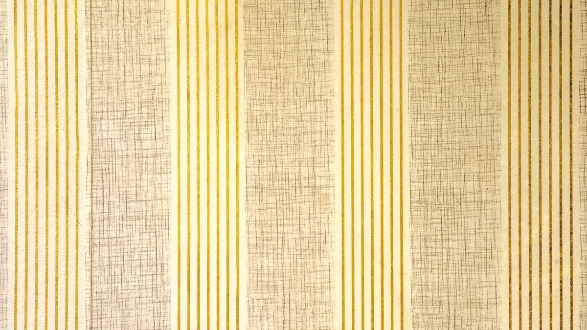
21. Textured vertical-stripe wallpaper
A wallcovering can create texture without demanding a bold paint color. The featured close-up shows beige-and-gold striped wallpaper with a tactile-looking finish, rather than confirmed natural grasscloth. Its lines give the wall a quiet repeated rhythm suited to a reading nook or bedroom accent. View more than a tiny sample because the stripe pattern becomes much more noticeable across an entire wall.
Ask the supplier whether the finish is actual woven fiber, embossed paper or printed vinyl. Their cleaning needs, seams and durability can differ. Check how the stripes meet at corners and consider what they will look like beside curtains or framed art. If the rest of the room already contains strong patterns, a quieter neutral cover may serve it better.
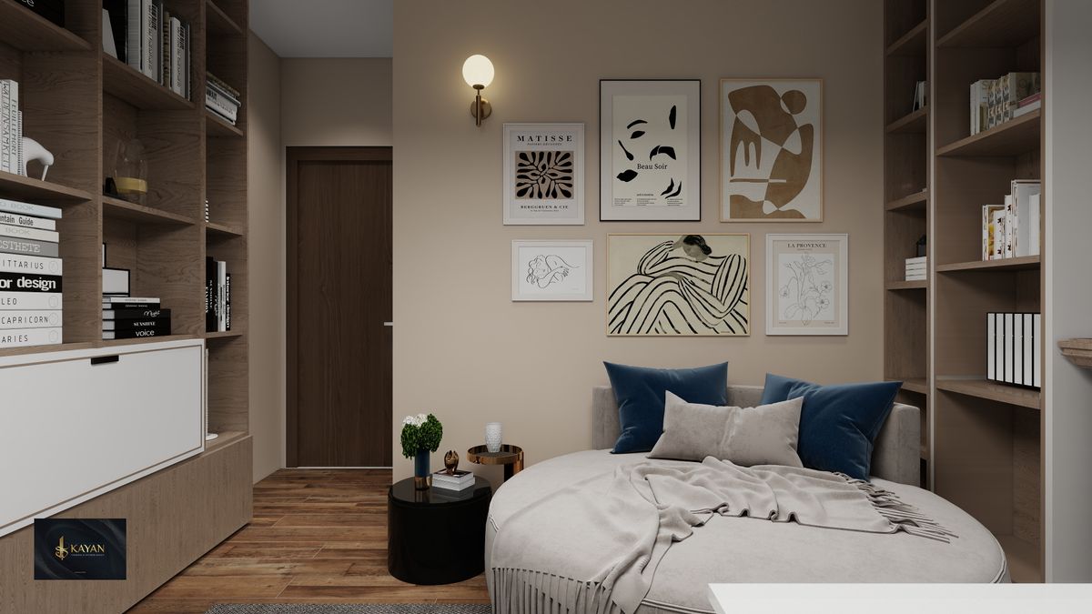
22. A single gallery wall
One wall of photographs, prints or collected artwork can serve as an accent without new paint or panels. Use a consistent framing rule or deliberate spacing so the arrangement has rhythm. Put the largest piece near the natural focal point and let smaller items support it. Too many unrelated frames can turn a personal collection into visual noise.
Start the gallery on the floor with all the frames in their intended arrangement. Place the largest piece near the visual center, then allow smaller images to relate to it through consistent spacing. A personal photo collection can look sophisticated without becoming a perfectly symmetrical grid. Remember to check how the arrangement relates to the sofa height and nearby lights. When you expect to add photographs later, leave one planned position open rather than improvising a crooked extension.
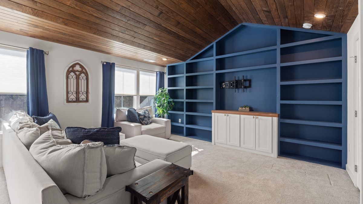
23. Painted built-in shelves as a feature wall
Built-in shelving can become the room’s feature wall when its painted finish gives the whole installation a clear identity. A blue or green cabinet wall can frame books and objects while the neighboring walls stay neutral. This works in a living room where real storage is needed and a collection deserves a dedicated place. Choose the shelf arrangement from what you actually own before deciding on the color, and plan anchoring for the materials and wall construction.
Use a restrained mix of display areas and closed storage if the design permits. Shelves filled edge to edge with assorted objects quickly become visual noise, regardless of the paint color. Leave enough room for large books and commonly used equipment, and position lighting so the recesses do not become gloomy. Full-height cabinetry is a substantial installation; plan around sockets, access panels, ventilation and the structure behind it. A coherent painted wall can be striking, but function should determine the final layout.
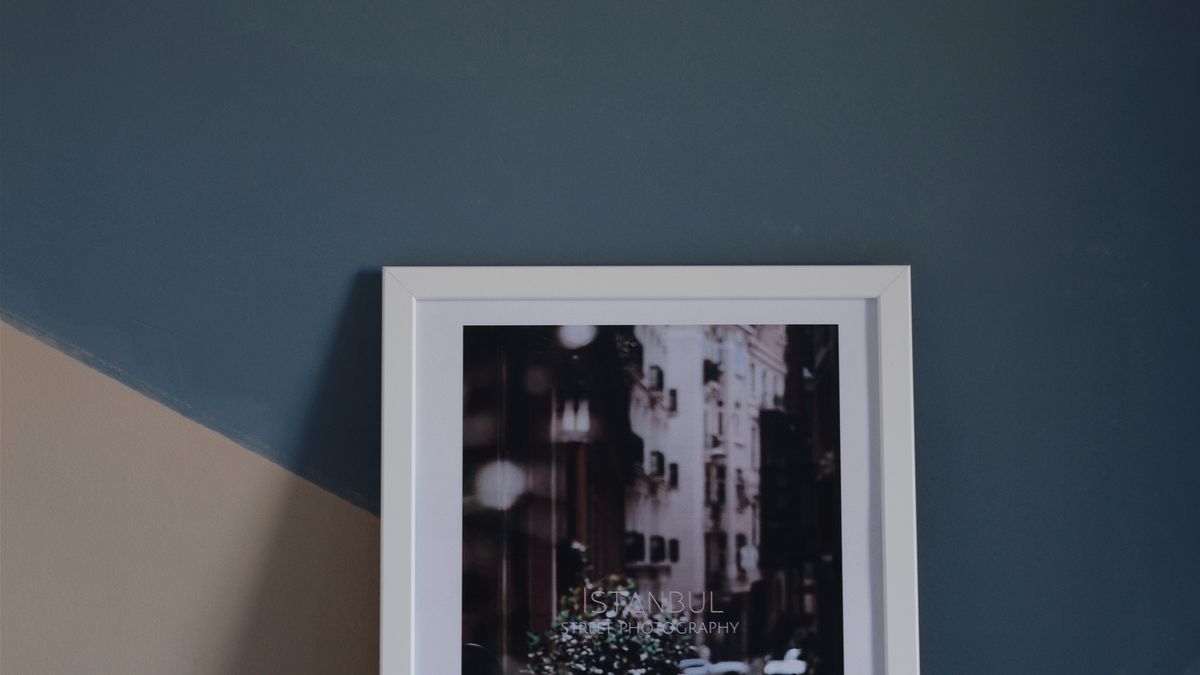
24. Wall-mounted art over a color block
A single oversized artwork over a restrained paint block can create a focal point without covering the whole wall. The art must have enough clearance around it and sit in relation to the furniture below. Choose the paint to support, not imitate, the dominant colors in the piece. This option is comparatively flexible because you can change the artwork without redoing the entire room.
Choose the artwork first, then borrow a supporting color for the block behind it. Otherwise you may end up shopping for a print that happens to match a fashionable paint. The block could be a simple rectangle slightly wider than the artwork or a vertical shape aligned with a console. Keep the relationship clear and do not add decorative borders merely because there is empty space. Properly secured art and careful proportions will do most of the work.
25. A timber-framed media feature wall
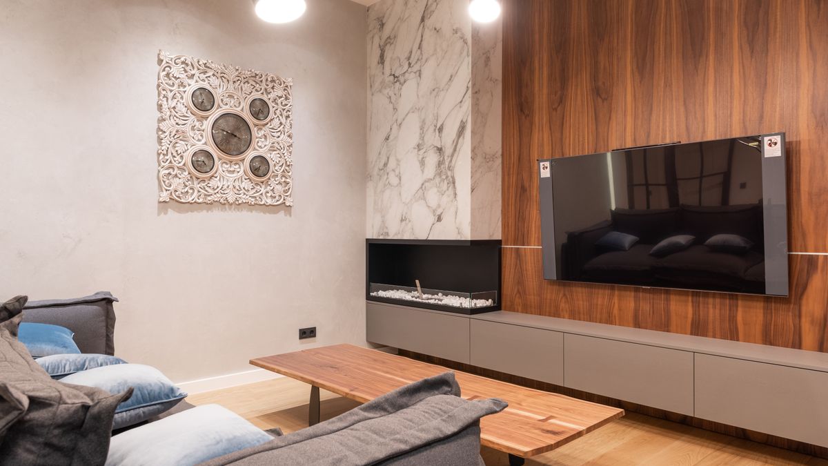
A television becomes easier to integrate when the wall behind it has one coherent material treatment. In the pictured living room, wood paneling gives the screen a clear home beside the seating area. Plan the screen’s comfortable viewing height and the actual locations of power sockets and devices before building the surround. The goal is a functional media zone with a deliberate backdrop, not a wall that competes with the screen.
The best design may be a simple expanse of timber, a restrained rectangular panel or a low console that echoes the wall finish. Avoid reflective surfaces that create glare. Ensure media equipment has access and ventilation rather than hiding it in a sealed box. This idea differs from the earlier vertical-slat treatment because the screen and equipment layout determine the design first.
26. An understated mirror accent
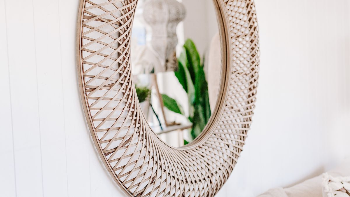
A large mirror can add light and perceived depth to an entryway or smaller living room if placed opposite something worth reflecting. Secure it using fixings suitable for its weight and the wall type. Do not position a highly reflective surface where it creates strong television glare or uncomfortable afternoon sunlight. A well-placed mirror is more useful than an entire wall of small reflective tiles.
A mirror only improves the room if it reflects light or a view you want to see. Stand where you usually enter the room and look at the intended mirror position before buying it. A reflection of a crowded open shelf may amplify clutter instead of relieving it. Choose a frame that relates to nearby fixtures but does not need to match exactly. For heavy mirrors, appropriate wall anchors and professional installation where needed are essential.
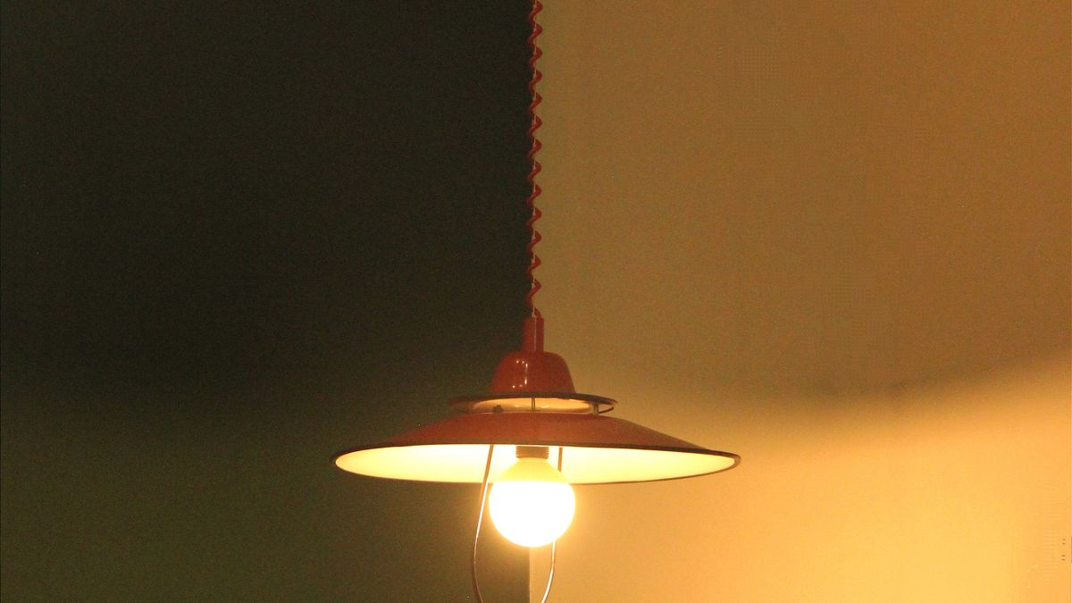
27. A dark ceiling and wall for a moody transition
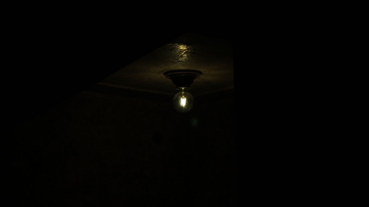
A dark ceiling can deepen the atmosphere of a reading corner or lounge, especially when the adjoining wall is also kept in a restrained, dark palette. The example photograph demonstrates how a low-key ceiling and wall respond to one simple light source; it does not establish that both surfaces were painted with the same product. The effect depends on controlled light and the perceived transition between planes.
Before committing to color drenching, test a large swatch in both daylight and evening lighting. Darker surfaces can feel inviting in a dedicated retreat but oppressive in an already narrow or poorly lit space. Mark vents, trim and ceiling edges before planning the treatment. Use task lighting where people actually read or work, not just one dramatic decorative bulb.
| Treatment | Best for | Main tradeoff |
|---|---|---|
| Paint | Fast color changes and low physical depth | Undertones and preparation matter |
| Wallpaper | Pattern and subtle woven-looking texture | Seams and cleaning needs vary |
| Wood or molding | Permanent architectural detail | Cost, thickness and installation |
Paint, wallpaper or panels: which should you choose?
Choose paint when you want a relatively straightforward change that can be repainted. Choose wallpaper when pattern or printed texture is the central idea and the wall is suitable for the material. Choose panels when architectural relief matters enough to justify more installation work and permanent fixing. Choose shelving when your actual problem is storage. The cost and difficulty depend on surface condition, materials, labor and how much preparation is needed.
In older buildings, avoid aggressively sanding or disturbing unknown coatings without checking what they contain and which local safety rules apply. The US EPA also warns that remodeling can disturb materials and affect indoor air quality; deal with moisture and ventilation problems before adding decorative layers. A feature finish cannot fix a wall that is damp, unstable or otherwise unsuitable.
Three mistakes that make accent walls look accidental
First, selecting the wall purely because it is empty. Your eye should have a reason to go there. Second, choosing a finish in isolation from floor, furniture and lighting. Finally, introducing several accent treatments into one modest room. When every surface asks for attention, none is the focal point. If you want two strong materials, let one dominate and the other quietly support it.
Frequently Asked Questions
Which wall should be an accent wall?
Usually the wall already associated with the room’s main focal point, such as a bed, sofa or desk. Check the view from the entrance and how the wall is interrupted by doors or windows.
Can a dark accent wall make a small room work?
Yes, depending on lighting, furniture contrast and the overall palette. Sample the color on a large area and inspect it through the day before committing.
Are accent walls still a good idea in 2026?
A useful focal point is not tied to a particular year. The decision should be based on the room and how you want to use it, not on a trend forecast.
What accent wall is easiest to reverse in a rental?
A permission-compliant paint treatment or carefully tested removable finish can be easier than installed paneling. Always check the lease and test the real wall surface.
What should I do if the wall has damp patches?
Identify and correct the moisture source first. Do not hide a damp surface beneath wallpaper, paneling or heavy paint and assume the problem is solved.
The bottom line
The best accent wall adds clarity to the room. Decide what you want it to frame, test materials under real lighting, and choose one treatment that suits both the surface and the way you live. Done well, it can make a room feel deliberate without replacing every piece of furniture.