A forearm tattoo looks simple until you have to choose the exact piece of skin it will occupy. A drawing that looks balanced on paper can feel cramped near the wrist, disappear around the outer edge of your arm, or make a future sleeve harder to plan. The right idea needs to work with the shape of your forearm as well as your taste.
These 27 concepts are starting points to discuss with a tattoo artist, not ready-made artwork to copy. Each has a placement suggestion, a reason it works, and a trade-off worth thinking through. If you want something discreet, start with the first group. If you want your forearm to become the center of a larger composition, look toward the final group.
How to choose a forearm tattoo before choosing the design
Inner forearm designs are easier to look at yourself and can feel relatively personal. Outer forearm pieces are often more noticeable to other people, especially when your arms hang naturally. A wraparound design reads in stages because no one sees the entire circumference from one angle. Try your preferred concept on a life-size paper template, then look at it with your arm straight, bent, palm up, and palm down.
Think about visibility at work, whether you might build a sleeve later, and how often the design will sit in the sun. The best decision is not necessarily the largest illustration you can afford. It is the one that still makes sense when you wear a shirt, hold a phone, or look at your arm from an ordinary conversational distance.
Minimal and understated forearm tattoo ideas
1. A single-line mountain ridge
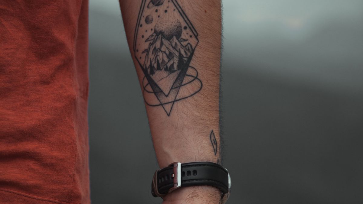
A mountain outline can run along the inner forearm without occupying every inch of space. Keep the highest peak away from the sharpest curve near the wrist, where a straight drawing can appear to tilt when your hand moves. This suits someone who wants a recognizable shape without a detailed landscape. Ask whether the chosen line weight will remain readable as the tattoo settles.
An especially useful variation is to let the ridge rise toward the elbow, leaving the wrist end lower and quieter. That creates a direction the eye can follow without adding a forest, compass, or inspirational quote. Ask for a version at two different lengths: the shorter version may fit your current style, while the longer one may balance the full forearm better. If you later add another tattoo, the clean lower edge makes it easier to keep the pieces distinct.
2. Small compass with restrained markings
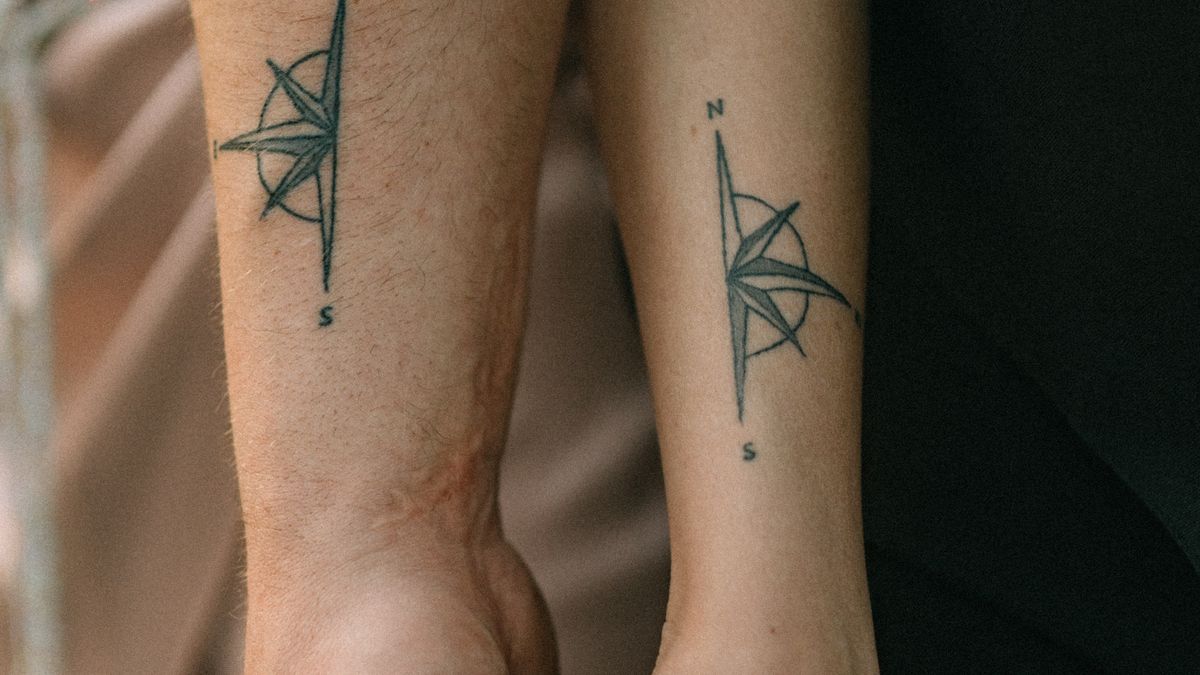
A compass works best when you give its north marker and central point room to breathe. Place a compact version on the broader upper inner forearm instead of squeezing every directional label near the wrist. It can be personal without becoming a giant navigation illustration. Avoid tiny lettering inside the dial unless your artist is confident it can remain legible.
A compass does not need an entire map behind it. For an understated version, choose one clear needle, four major points, and a ring that has enough space between its lines. For a more graphic treatment, omit the circle and let the arrows form the symbol. If your job requires tattoos to be covered at times, test the stencil while wearing the sleeve length you usually choose. A seemingly compact design can extend past your cuff when placed too low.
3. Clean black band with deliberate spacing
A band is more about proportion than subject matter. One medium black band can look controlled; two narrower bands create rhythm, but the gaps need to remain visually consistent around the moving arm. Ask to see the stencil with your forearm rotated because a perfectly straight drawing is harder to achieve on a tapered surface. Solid areas also deserve an honest discussion about commitment and removal.
The forearm tapers, so a band can appear broader on one side even if the stencil uses an identical width throughout. Discuss whether a true uniform band or a visually balanced band is the better goal. If you expect to add tattoos between two black stripes, test that future spacing before placing the second one. Heavy black coverage can also make a later correction more demanding; this is a good example of a simple-looking tattoo that deserves careful planning.
4. A short phrase in plain lettering
Choose words that still matter to you when the language of the moment has passed. The side of the inner forearm can hold a restrained, readable phrase without becoming a full-width banner. Simple typography often ages visually better than densely flourished scripts at the same size. Check every letter, translation, spelling, and orientation before the first line is made permanent.
Try your chosen words in three typefaces at the same real-world size, not on a phone screen where everything looks crisp. Ask somebody who has not seen the phrase before to read it at arm’s length. That is a better test than whether it looks elegant in a zoomed-in mockup. If the message is private, you may prefer it oriented toward yourself on the inner arm, but understand that it will appear upside down to other people when you show them.
5. Roman numerals with generous spacing
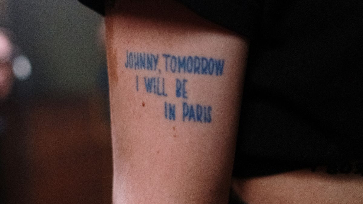
Dates are meaningful to the wearer, but long numeral strings can become a dark ribbon when cramped. Place them lengthwise on the flatter inner forearm and ask for a mockup at the intended size. If the numbers mark someone else’s birthday or an event, double-check the conversion yourself. Meaning is not a substitute for readable design.
Consider dividing a long date into two well-spaced groups rather than packing every symbol into one dense row. A meaningful anniversary can sit near the middle of the inner forearm, where there is usually more width than at the wrist. Try the date with and without surrounding dots, bars, or ornament. If the simplest version communicates what matters, the decoration is optional. A mistaken numeral is particularly frustrating because the design is supposed to record something exact.
6. A simple constellation or star map
A few points and connecting lines can make a quiet piece, particularly on the side of the forearm. You do not need a full sky chart to represent a place or date. Confirm that the arrangement is accurate if you claim it depicts a real constellation. Tiny stars and excessively fine lines may lose separation over time, so keep the design open rather than delicate for its own sake.
A constellation may look delicate on paper but should still have an unmistakable star hierarchy. Let its brightest points be slightly larger while making secondary points fewer and smaller. A restrained connecting line can establish the pattern without turning it into graph paper. An artist may recommend omitting real astronomical details that would be too tiny for the intended size. If the design is linked to a person’s birthday, verify the chosen constellation independently instead of relying on a social-media graphic.
7. One botanical branch in black ink
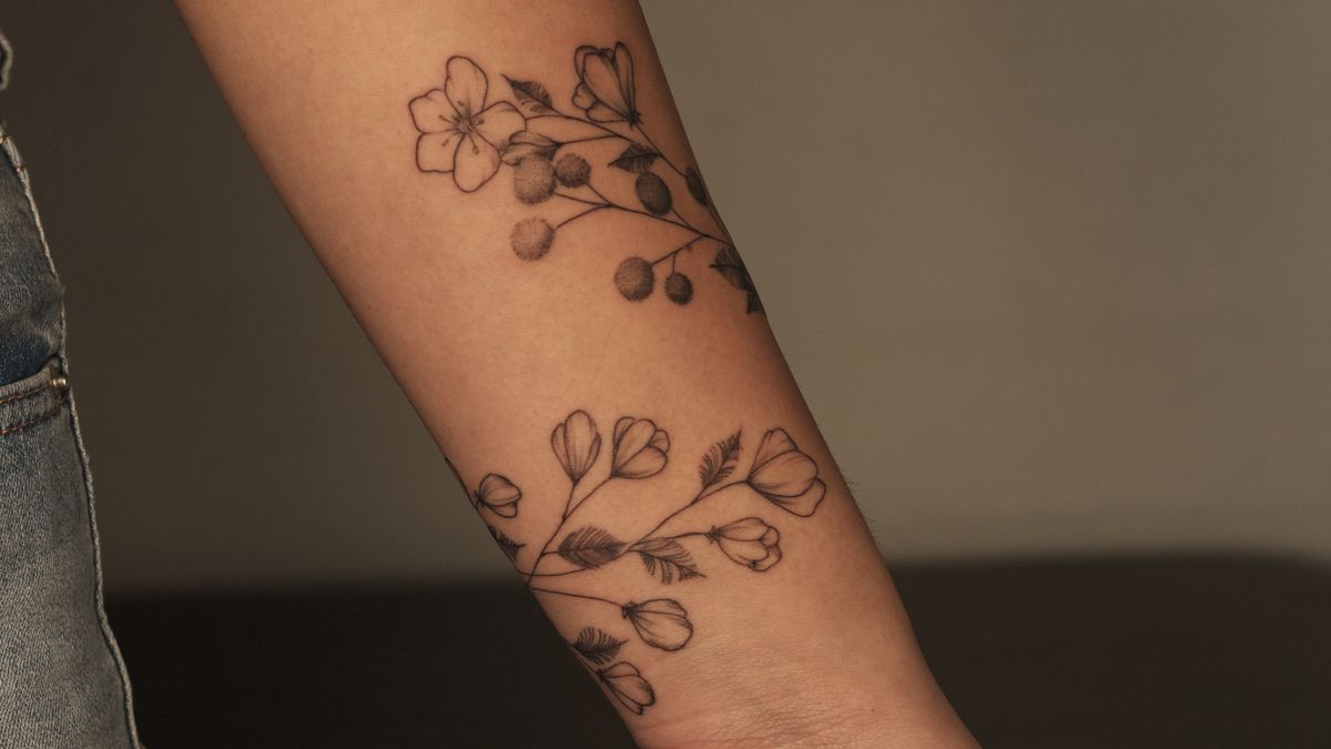
An olive branch, fern, or other plant silhouette follows the forearm’s length naturally. Choose the plant because you like its form or meaning, not because a caption assigns it a universal symbolism. A slightly curved stem can sit along the inside edge while leaves point toward the broader part of the arm. Leave enough empty skin around individual leaf shapes.
For a more masculine, graphic interpretation, consider a branch with heavier central structure and fewer individual leaves. The form can point from wrist toward elbow, naturally following your arm’s taper. A side-forearm placement allows some leaves to disappear around the curve, but do not put the most recognizable features on the hidden edge. If you already have a watch or bracelet you wear daily, test whether the stem collides visually with those accessories.
8. Minimal wave or waterline
A wave works when its movement is clear from a few confident curves. It can sit above the wrist without crossing the crease, making it easy to extend later into a larger nature composition. Resist filling every space with foam and fine dots. The strongest small wave tattoos often rely on one distinctive break or crest rather than a miniature ocean scene.
A single dark crest and an open arc beneath it create a more legible wave than dozens of thin foam marks. You can also choose a three-line horizon treatment if you want less movement. Position matters: near the elbow, a slightly broader wave can hold more detail; near the wrist, restraint matters. If the design represents a specific coastline or surfing memory, the shape can be customized, but avoid pretending every generic wave is an accurate depiction of that location.
9. Personal coordinates in a quiet layout
Coordinates offer a specific reference without requiring a literal illustration of the location. Use a clean font on the inner forearm and verify the coordinates against the actual place before approving the stencil. The numbers need comfortable spacing, especially around degrees and decimal points. You can keep the meaning private without making the tattoo visually obscure.
A sequence of latitude and longitude numbers can become surprisingly wide. Ask the artist to set it in a clear typeface and print it at exactly the planned size before choosing the position. One line generally feels cleaner; two lines might fit a shorter section of the arm while becoming more prominent. If privacy matters, consider whether your location is tied to a home or another personal address. A tattoo stays public long after you forget that strangers can read it.
Illustrative forearm tattoos with more character
10. Blackwork raven or crow
A raven’s strong silhouette gives an artist an opportunity to make a recognizable shape using limited shading. A perched bird can sit vertically on the outer forearm; a flying bird often needs more width. Decide whether you want feathers, realism, or a near-solid silhouette before the consultation, since those directions require very different line and shadow strategies.
Silhouette and detail are two separate decisions here. A crow in flight requires wing length and negative space between feather groups; a perched raven depends more on the beak and body outline. You can make the piece darker and bolder without turning the entire bird into a featureless patch. Ask the artist to show the shape filled in at normal viewing distance. If you like gothic imagery but want a smaller commitment, a perched bird on a simple branch can make the composition more contained.
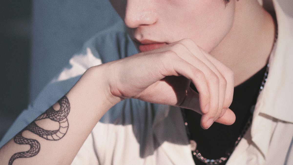
11. A snake that follows the forearm
A snake is one of the few subjects that genuinely benefits from wrapping around the arm. Its body can move from the inner wrist toward the outer upper forearm, creating a design that changes as you turn your hand. Watch the distance between the coils. If they are tightly stacked, the image can read like one dark mass from several feet away.
Because a snake bends, the head deserves the most deliberate position. Some people want the face visible on the inner forearm when they look down; others prefer it outward-facing. Work backward from that decision and let the body curve around the arm naturally. A snake with a few broad bends is often easier to read than one with many tightly packed loops. Check how the design behaves when you flex your wrist, especially if part of the tail approaches the crease.
12. An architectural arch or doorway
An arch creates structure without requiring a detailed building. Put the opening on the broader outer forearm so the silhouette remains obvious, then decide whether the inside contains a landscape, a simple shadow, or nothing at all. This design is particularly useful for someone drawn to architecture and clean geometry. It fails when every brick and ornament is compressed into a small stencil.
An arch can be purely architectural, but it can also serve as a frame for a meaningful view: a courtyard, steps, or an open horizon. Choose one clear depth cue, such as an inner shadow, instead of adding tiny repeating stones. The design benefits from vertical placement, where the top of the arch points toward the elbow. Ask to see it both centered and slightly off-center on the outer forearm. The latter may sit more naturally depending on your arm’s contour.
13. A fine-line sword or dagger
A narrow blade follows the arm’s length, but it should not sit so close to the wrist that the point appears crowded. Pay attention to symmetry between the handle, guard, and blade. The concept can be purely graphic or tied to an actual historical reference, but it benefits from clear scale. Ask whether the handle details will still be distinguishable at full size.
A sword is particularly unforgiving when the line of the blade and the central axis do not match. Rather than centering it by eye from one direction, test the stencil with your palm forward and then turned inward. A plain handle creates a contemporary look; an ornate crossguard moves it toward an illustrative or historical style. Keep either approach coherent. If the piece is intended to symbolize a particular historical weapon, confirm its actual form before borrowing decorative details.
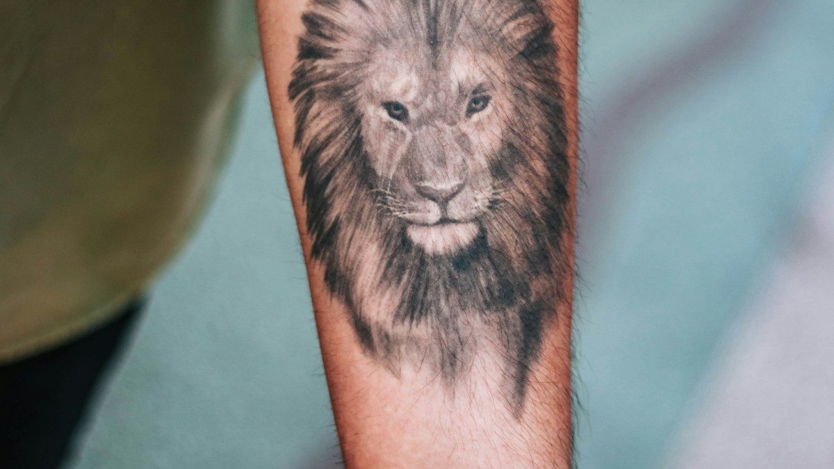
14. A realistic animal portrait
A wolf, big cat, dog, or another animal can anchor the outer forearm, where there is room for eyes and facial structure. Realism is unforgiving when the face is too small. Pick an artist whose healed work demonstrates convincing portraits, not merely impressive fresh photographs. If the subject is your pet, provide several clear photographs and discuss what features make it recognizable.
Animal portraits depend on what makes that animal immediately identifiable. For a wolf, it may be the ear and eye proportions; for your own dog, a particular facial marking or expression may matter more. Give the artist photographs from several angles rather than a single filtered image. An overly dark background can swallow the outline of the head on a narrow forearm. Ask for a preview that shows the animal at natural arm’s length, not just enlarged on a monitor.
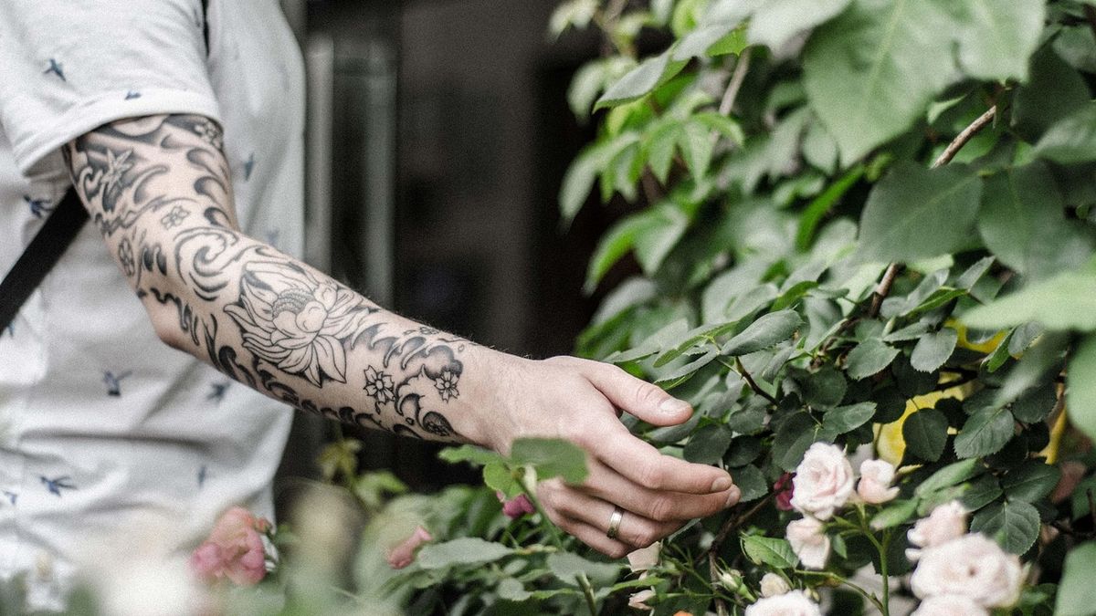
15. A single Japanese-inspired peony
Large petals can fit the rounded forearm beautifully when the composition has breathing room. If you want a traditional Japanese approach, work with an artist who understands that visual tradition rather than treating it as a random collection of motifs. A single flower can stand alone or lead toward a larger sleeve. Discuss cultural references, background shapes, and intended continuity before committing.
One large open petal can supply the focal point while a handful of smaller leaves complete the shape. If your goal is a Japanese traditional tattoo, the flower should be composed as part of that visual language, not merely labeled with the style. Discuss whether its petals face outward or toward you. Also consider future coverage: a peony that finishes sharply at the wrist may later clash with an intended sleeve background unless the edges are planned.
16. A framed woodland scene
A forest silhouette inside a narrow frame offers a clear boundary for men who prefer defined artwork. Keep the number of tree trunks under control so the piece reads at a glance. The outer forearm can carry a vertical scene without demanding a full wrap. If you add moonlight or mist, ask how those lighter areas will be represented through negative space rather than delicate grey haze alone.
An obvious frame gives a woodland scene a neat beginning and end. A softer fade can feel more atmospheric, but it requires precise shading to avoid looking like an unfinished rectangle. Try three levels of contrast: a dark foreground trunk, a lighter second row, and open sky. Do not ask for a photographic forest compressed into a two-inch strip. If you care about a particular place, bring your own reference photographs and identify what makes that landscape recognizable.
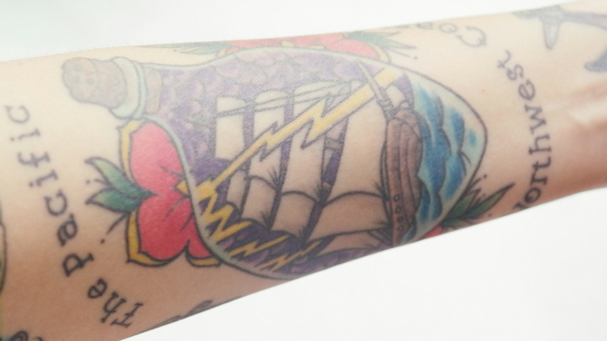
17. A vintage nautical illustration
An old-fashioned ship, lighthouse, or anchor can suit the forearm if the subject is simplified to the scale. A lighthouse often works vertically; a ship needs more width for the hull and rigging. Choose between bold traditional outlines and detailed engraving-style lines rather than mixing them indiscriminately. This is an opportunity for storytelling, but not every rope or window needs to appear.
Traditional nautical imagery can be highly readable because the major shapes are strong. For a lighthouse, focus on the tower, beam, and coastline rather than dozens of stone blocks. For a ship, establish the masts and hull before the ropes. A vertical piece can sit on the inner forearm while a broad ship often suits the outer area. Choose one visual tradition and let the artist adapt its line weights to the size; elaborate engraving is not automatically better.
18. A geometric animal silhouette
Use polygons or angular planes to define an animal’s profile without pursuing realism. A fox, bear, or stag can feel distinctive when the geometry supports the recognizable outline. It works well on the outside of the forearm because the viewer can read the whole shape from a single angle. Avoid a web of tiny intersecting lines that only makes sense in a close-up.
Angular work can feel sharp and modern, but symmetry needs to support the animal rather than replace its anatomy. Ask for a silhouette-first sketch before adding geometric lines. If the animal is not recognizable when the internal lines are removed, the concept may rely too heavily on decoration. Keep enough distance between line intersections so they do not visually merge. This works well as a standalone piece because a confident outer contour separates it from future tattoos.
Statement forearm pieces and larger compositions
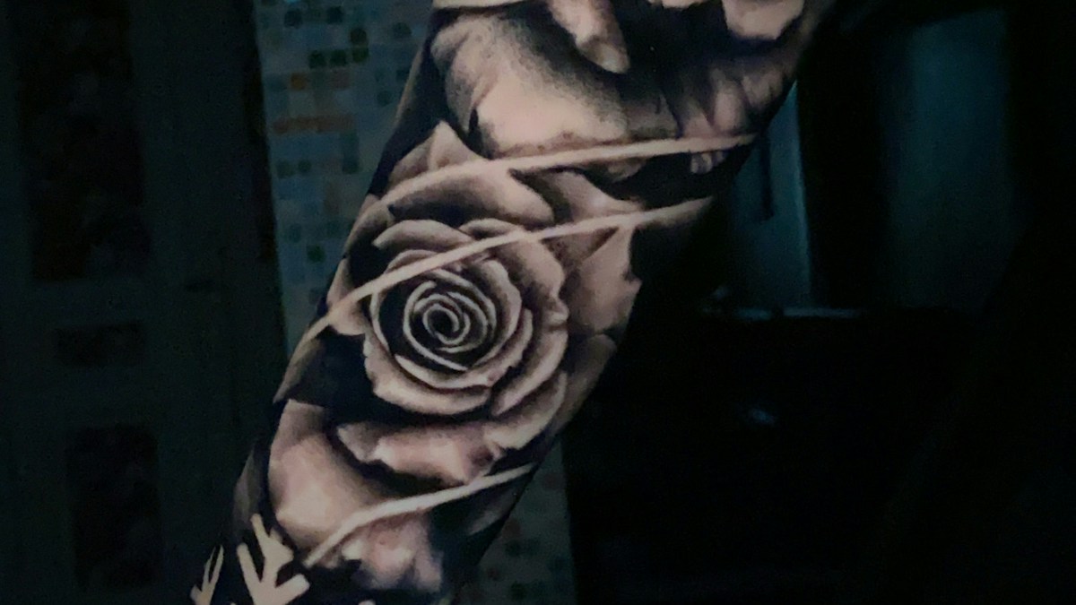
19. A black and grey floral forearm composition
A floral half sleeve can cover the forearm from near the elbow toward the wrist while still allowing clear skin around the edges. Give one bloom the leading role, with smaller leaves and secondary flowers guiding the eye. The artist should plan what appears from the front, side, and back. A collection of individually attractive flowers is not automatically one cohesive composition.
A good floral half sleeve has a beginning, a centerpiece, and a natural finish. A major bloom near the widest part of the forearm can anchor it, while leaves and stems narrow toward the wrist. Ask the artist to show a full rotation of the design because some petals will disappear around the arm. If the work includes open skin, protect those gaps from being filled with generic shading just to make the piece feel complete.
20. A storm cloud and lightning composition
A storm motif gives you the contrast of soft clouds against one decisive lightning shape. On the outer forearm, the bolt can lead down toward the wrist without needing to touch it. Heavy shading can support the mood, but too much uniform grey may flatten the result. Decide whether the drama comes from the silhouette, the lighting, or detailed realism, then make that one idea dominant.
Weather compositions benefit from a controlled light source. Decide whether the lightning itself is the brightest feature or whether the clouds carry the interest. On dark skin and lighter skin alike, an artist must plan contrast for the actual canvas rather than depending on a digital glow effect that cannot simply be tattooed. Ask for a realistic rendering of what the design will look like without the edited light bloom common in online inspiration images.
21. An abstract brushstroke or ink sweep
An expressive black stroke can make a forearm feel like a single piece of art rather than a collection of symbols. It works best when the artist tests the movement from elbow to wrist and understands the amount of uninked skin needed alongside it. The apparent spontaneity should still be carefully designed. Large solid black sections are a serious commitment, so request a full-scale stencil first.
Brushstroke tattoos make the transition between full black and open skin a design element. That edge can be crisp, broken, or tapered, but it should be intentional. Try a stencil that starts higher on the forearm and sweeps toward the wrist without entering the joint crease. If you may later add recognizable figures, leave enough open area for them. An abstract piece is worth discussing in terms of balance and movement, not only what it is supposed to symbolize.
22. A map contour or topographic pattern
Contour lines can represent a landscape without drawing a literal mountain or city. You might use a genuine elevation map of a personally important place, or an abstract contour rhythm with no geographical claim. Let the pattern widen and narrow with the arm. Too many near-parallel fine lines can crowd together, so balance detail with larger open areas.
Real topographic lines have their own intervals and patterns, while an abstract contour tattoo can prioritize visual rhythm. Decide which you actually want. A map of a meaningful hiking destination can become an elegant personalized idea, but the level of detail has to suit the space. Ask to enlarge the source until the lines are separated clearly, then remove secondary details that would crowd together. Avoid labeling the drawing as a true map when you have altered its geography beyond recognition.
23. A mechanical or biomechanical panel
For a forearm that looks like an engineered structure, gears, plates, and layered shadows can follow the arm’s natural bends. This approach depends heavily on convincing perspective. The shapes should seem to turn around your anatomy, not float above it like a flat sticker. Ask the artist to sketch the design directly with your arm in several positions.
Biomechanical effects are strongest when there is an imagined structure beneath the skin, not when every available patch is filled with a gear. Ask the artist to explain which visual component is ‘above’ or ‘below’ another. The forearm’s contours can support that illusion, especially along the outer edge near the elbow. Because the style uses extensive shading, the artwork benefits from a careful discussion of scale, darkness, and how it might connect to the upper arm.
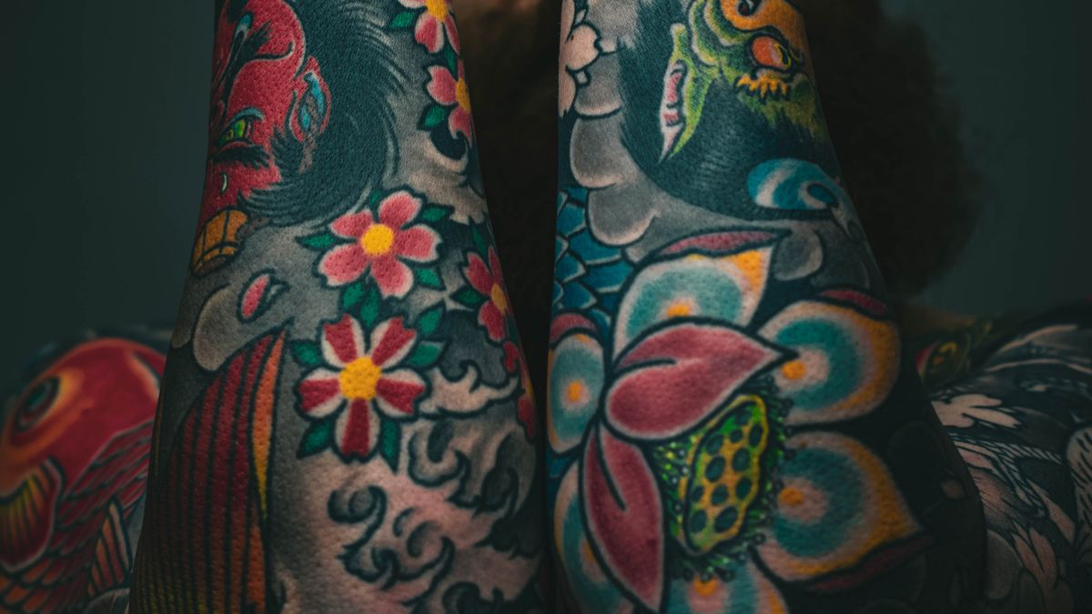
24. A Japanese-inspired koi in motion
A koi can swim diagonally around the forearm, making it a natural candidate for a wrap. Its body provides direction and the surrounding water can connect to future upper-arm work. Traditional Japanese tattooing has its own established visual conventions; find a specialist if that is the approach you want. Avoid combining motifs casually when you do not understand their cultural context.
The fish’s direction controls the whole composition. A head pointing toward the elbow creates an upward movement, while an angled wrap can emphasize the curve of the forearm. Keep enough separation between the tail, fins and flowing water that none becomes an indistinct mass. In a traditional Japanese composition, surrounding elements and their relationships matter; this is a strong reason to consult someone who specializes in that work rather than mixing motifs from unrelated references.
25. A classical sculpture fragment
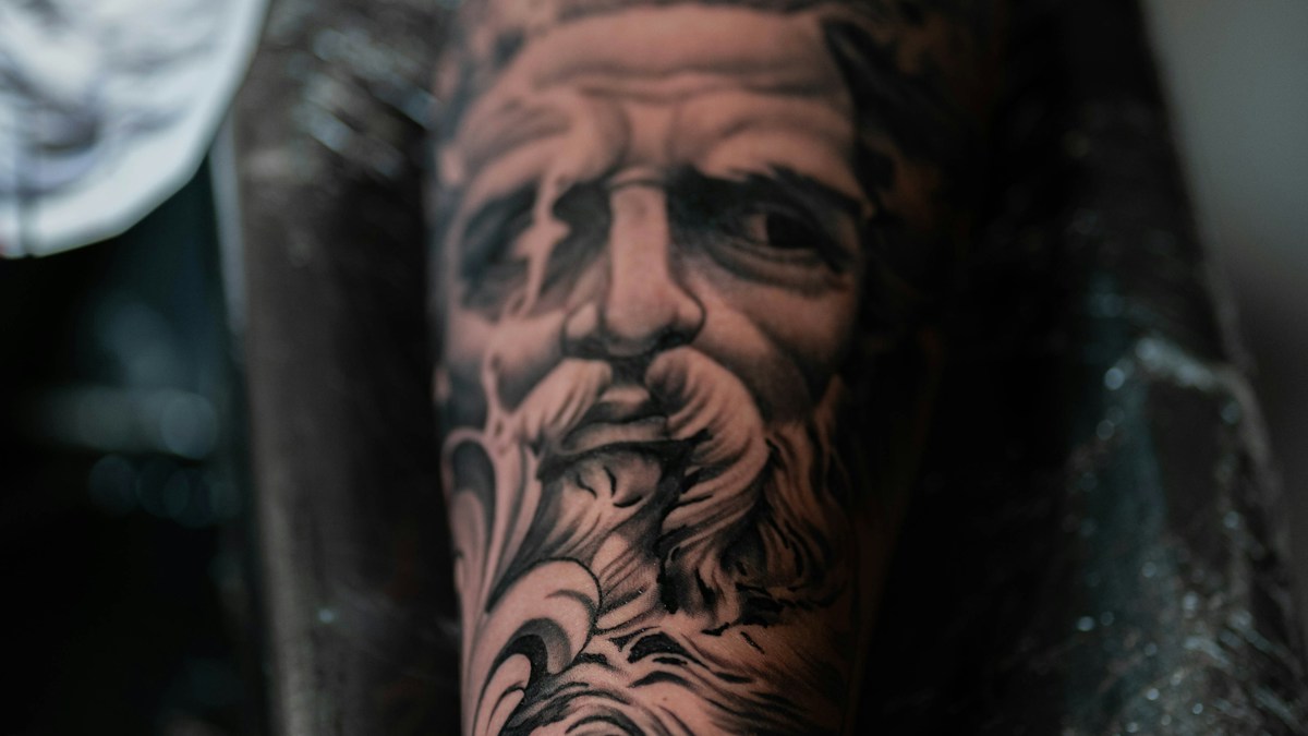
A cropped stone face, hand, or architectural fragment can create a thoughtful black and grey piece. The outer forearm generally provides better space for facial proportions than a narrow strip near the wrist. Keep the composition selective, perhaps one strong profile with contrasting empty background. A lifelike statue tattoo needs a skilled artist and sufficient scale to handle subtle shadows.
If you like sculpture but do not want a whole portrait, a cropped hand holding an object or a partial bust can communicate the idea. That narrower focus is often easier to place than a detailed full figure. Decide what the image should reveal and what can disappear into negative space. The piece depends on believable volume and shadow; collect examples of the artist’s healed stone, cloth or portrait work to confirm that the effect survives outside fresh studio photography.
26. An ornamental wrap with negative space
An ornamental design can circle part of the arm, leaving deliberate breaks so the skin becomes part of the pattern. Choose original geometry developed with your artist rather than copying ceremonial motifs from a culture you do not belong to or understand. The spaces between dark areas are as important as the filled shapes. Check the design from all sides before approving the layout.
Ornament can follow anatomical landmarks, but copying a pattern without knowing its origin is easy to get wrong. Start with geometric movement you can describe: repeated arcs, open diamonds, or a central spine of shapes. Then let the artist create an original rhythm suited to your forearm. A half-wrap may be more legible than a full band if you want the design to have a clear front. Leave a deliberate break instead of forcing two patterns to meet awkwardly.
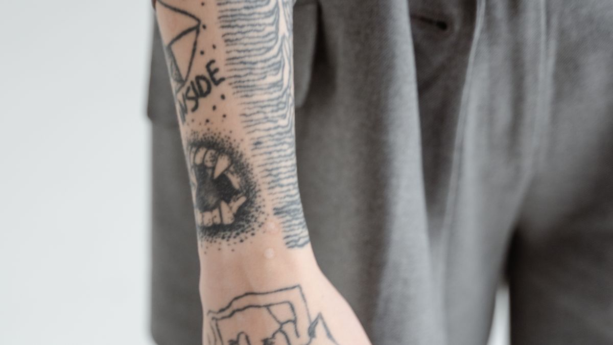
27. A planned patchwork forearm
Patchwork can work when separate motifs share a visual rule: similar line weight, a restrained palette, and enough space for future additions. Place your strongest piece first, then leave useful gaps rather than filling everything immediately. A small anchor, insect, botanical drawing, or personal symbol can coexist without matching subjects exactly. What makes the forearm feel intentional is spacing, not buying all the tattoos in one appointment.
Begin patchwork with a simple map of your forearm. Mark the central outer area, the inner section, the wrist taper and the spaces a future piece might need. Choose one anchor design with enough character to stand on its own, then add smaller tattoos over time. Matching line weight and contrast matters more than making every subject part of one theme. The biggest mistake is filling gaps with tiny symbols that no longer have room to breathe.
Which forearm placement makes the most sense?
Choose the inner forearm when you want to see the piece often yourself or prefer the design to appear as you turn your palm upward. Choose the outer forearm for a strong illustration that reads more readily when the arm is relaxed. Use the narrow side for slim vertical pieces. Choose a wrap only when the subject has a reason to travel around the arm. Your artist can adjust these principles for your anatomy, existing tattoos, and scars.
| Placement | Best fit | What to check |
|---|---|---|
| Inner forearm | Personal motifs and designs you want to see yourself | Check the stencil palm up and with a sleeve. |
| Outer forearm | Illustrations that should read when your arm hangs naturally | View it from ordinary conversational distance. |
| Narrow side | Slim vertical designs or lettering | Turn the arm to check what disappears around the edge. |
| Wraparound | Flowing subjects or patterns designed for movement | Inspect the stencil from every angle and plan future pieces. |
Before booking, ask for a life-size stencil, view examples of the artist’s healed work, and discuss how much contrast the design requires. A concept that depends on hair-thin details may need to become larger or simpler. If your longer-term goal is a sleeve, show the artist where future pieces might go so today’s tattoo does not force tomorrow’s awkward filler.
A practical checklist before you book
Before booking, you should be able to answer all five questions:
- Can I recognize the subject at arm’s length?
- Does the design work when I rotate my arm?
- Do I understand its cultural or personal meaning?
- Have I reviewed suitable healed work by this artist?
- Am I comfortable with its visibility, permanence and the difficulty of removal?
If two answers are still uncertain, refine the design before committing to an appointment.
How do you look after a new forearm tattoo?
Follow the written aftercare instructions from your qualified tattoo professional. A new tattoo is an intentional skin wound, so hygiene matters. The FDA notes that infections and allergic reactions are possible and advises contacting a health professional if the area fails to heal normally or you develop symptoms such as a rash or fever. Do not diagnose a worrying reaction from social-media photographs.
Once healed, sun protection matters. The American Academy of Dermatology advises broad-spectrum, water-resistant SPF 30 or higher on tattooed skin exposed to the sun. Do not put routine sunscreen on an open, fresh wound without appropriate guidance. For a simple daily framework, our men’s grooming routine and skincare buying guide explain where consistent skin care fits without filling your bathroom with products.
Frequently Asked Questions
Are forearm tattoos suitable for a first tattoo?
They can be, because there is room for many sizes and styles. What matters more is whether you have thought through visibility, permanence, placement, the artist, and aftercare.
Is the inner or outer forearm better?
The inner forearm can feel more personal and suits many narrow designs. The outer forearm can give larger illustrations stronger everyday visibility. Neither is universally better.
Do fine-line forearm tattoos age well?
How they look over time depends on the design, the artist, your skin, exposure, and care. Ask to see the artist’s healed fine-line work, not only fresh photographs.
Can I start a sleeve with one forearm tattoo?
Yes, but plan its size and direction as part of a larger composition. Leaving deliberate negative space gives later additions more options.
How much will a forearm tattoo cost?
Pricing depends on local studio rates, artist demand, size, complexity, and the number of sessions. Seek an itemized quote for your actual design rather than trusting a universal online figure.
The bottom line
A good forearm tattoo should still work when it is not being photographed. Choose a concept you can explain to your artist, test its scale on your actual arm, and give the composition enough room to remain readable. Whether you prefer a single line or a full wrap, the most valuable detail is the one you considered before the needle touched your skin.
Considering a larger canvas instead? Compare the placement and composition options in our 27 back tattoo ideas for men.